A playful twist of
Beutelsbacher Organic Juices
· Personal Project ·
Always face the sunny side of life
· Sarah Pramberger Psychotherapie ·
Always face the sunny side of life
· Sarah Pramberger Psychotherapie ·
Category
· Label Redesign
· 3D-Animation
Year
· 2025
Credits
· Unsplash photos
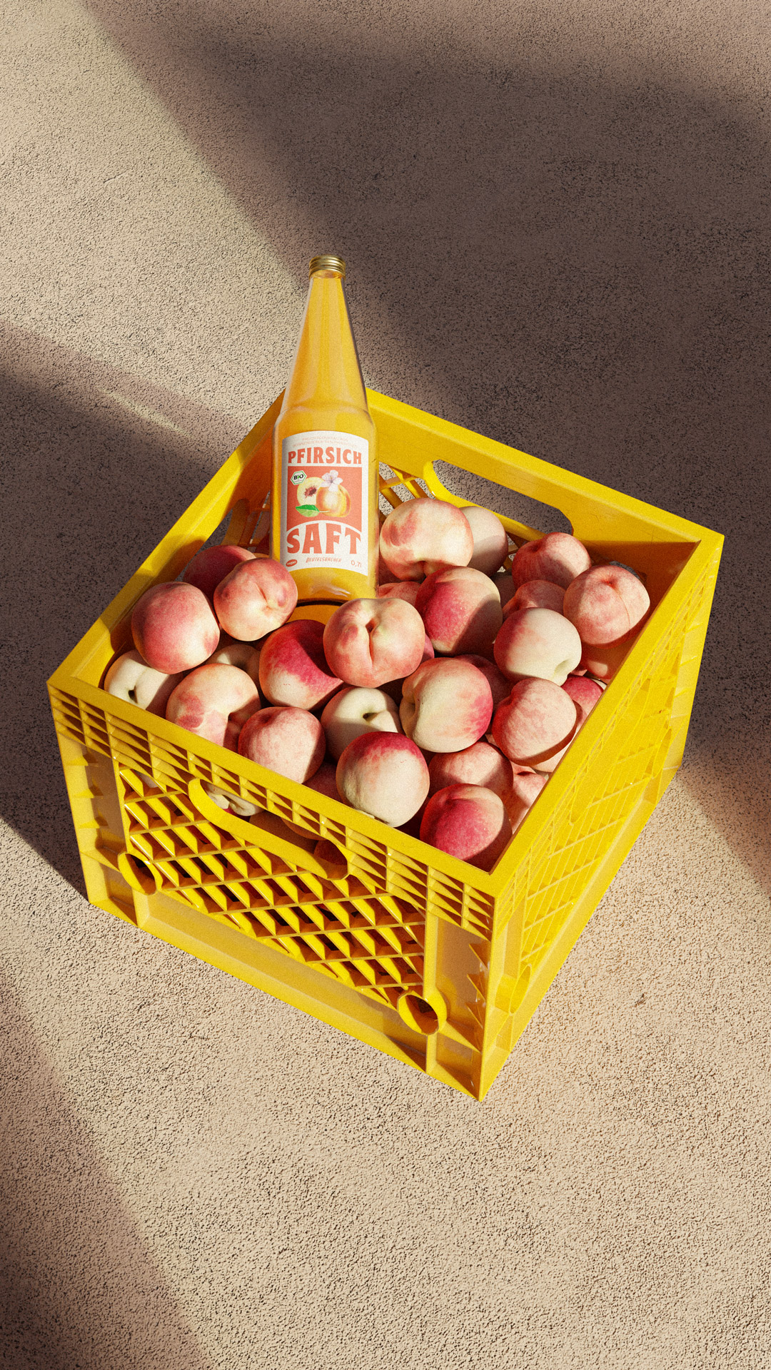
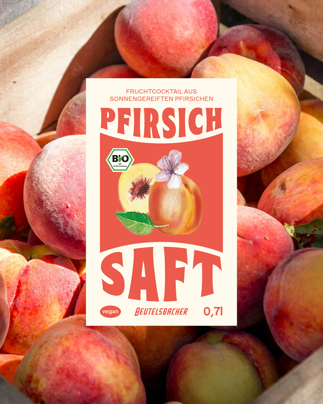
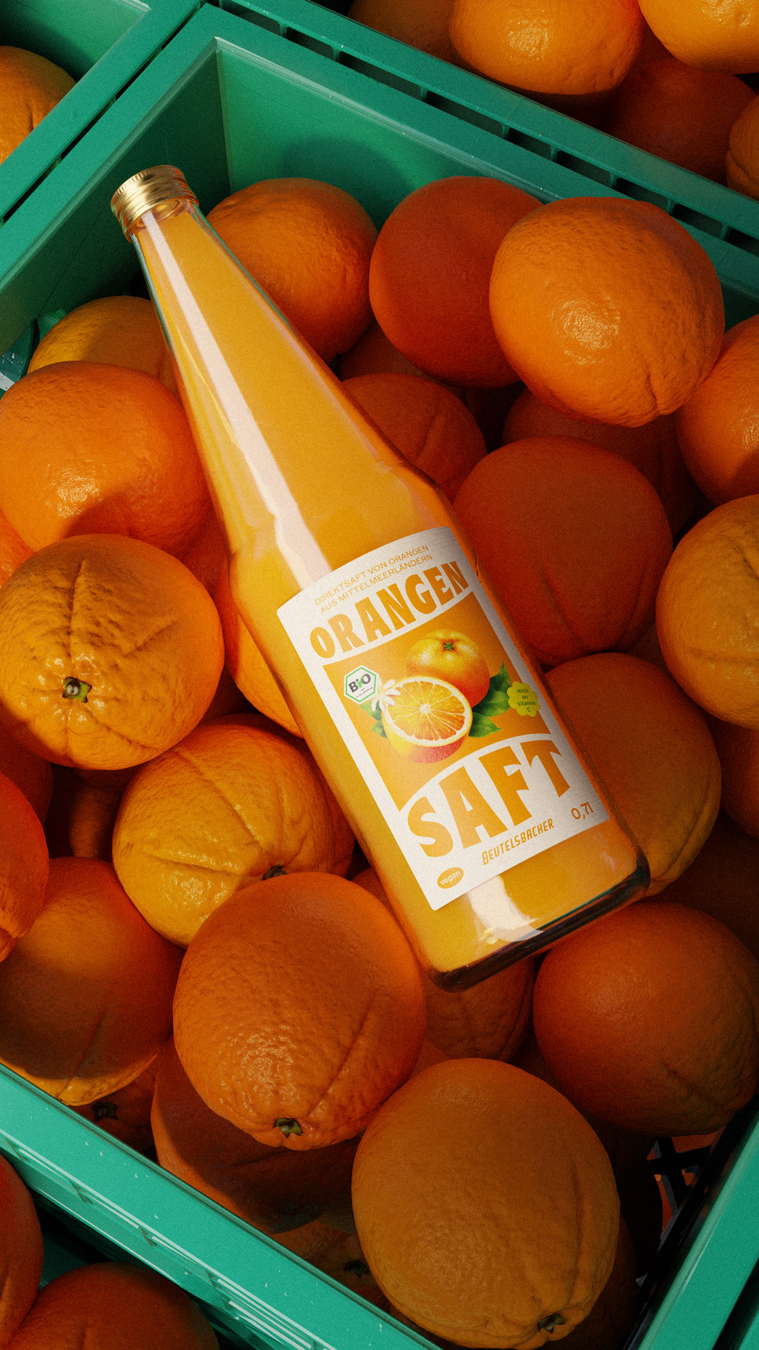
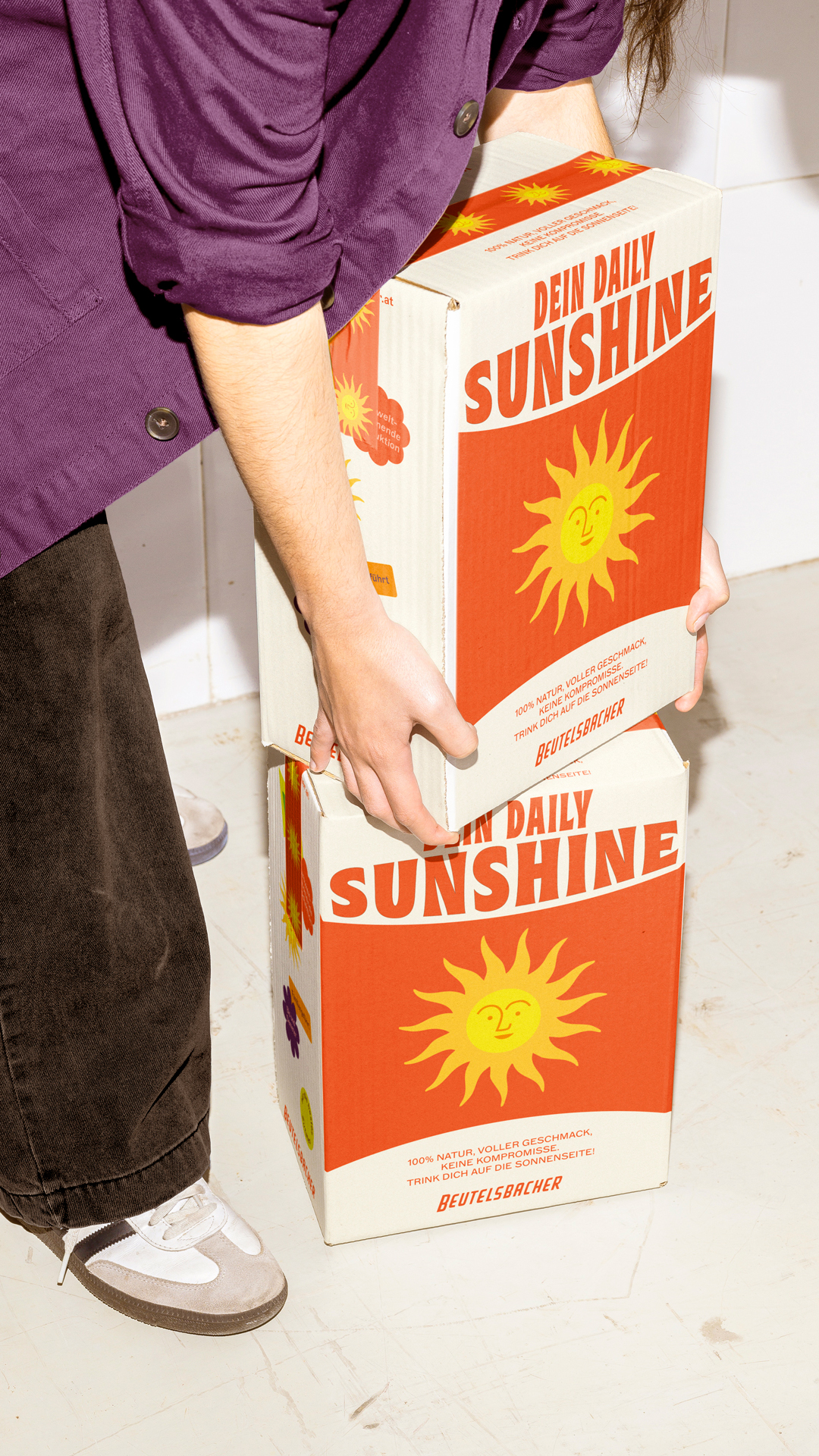
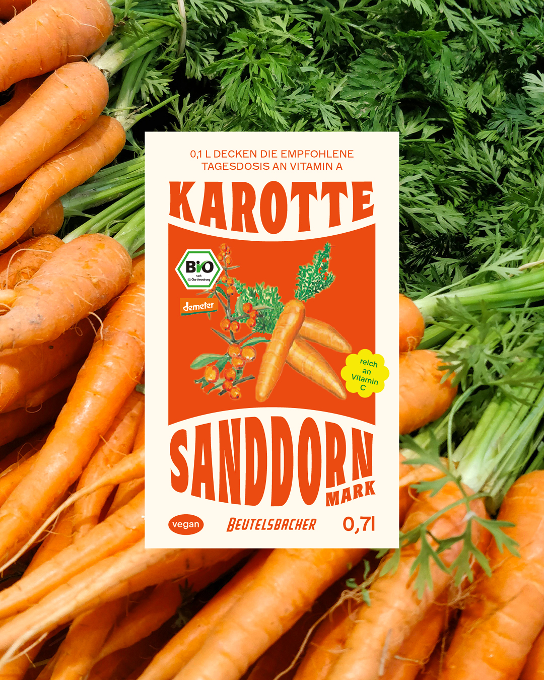
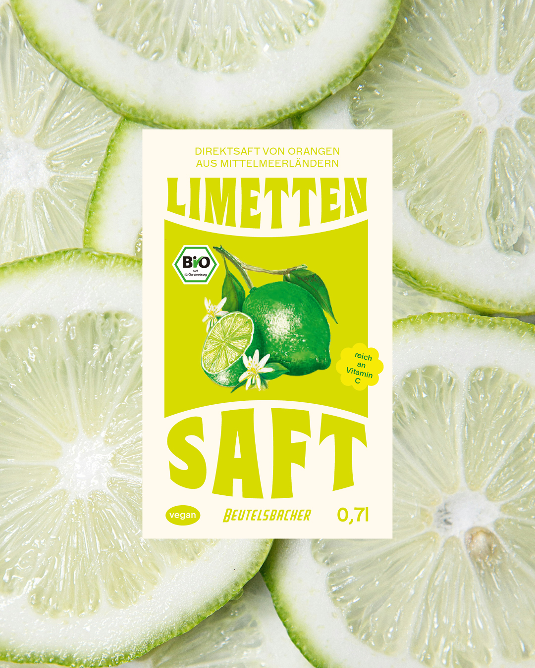
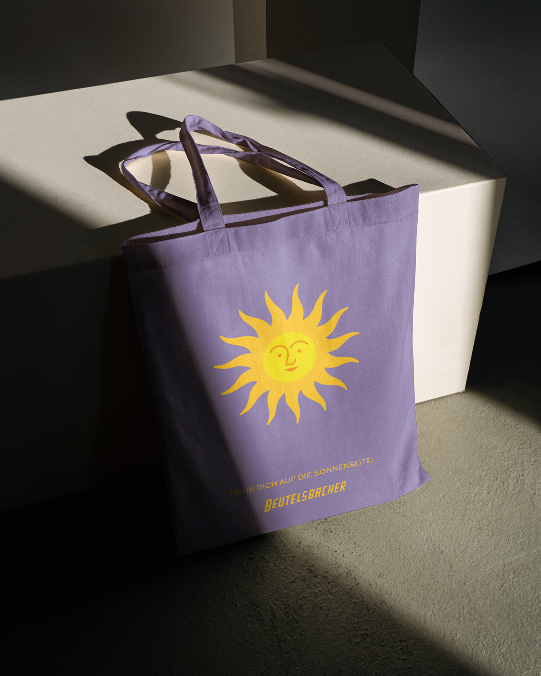
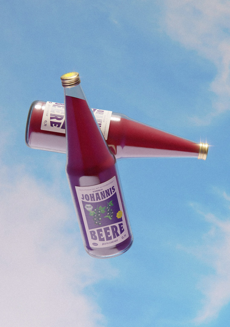
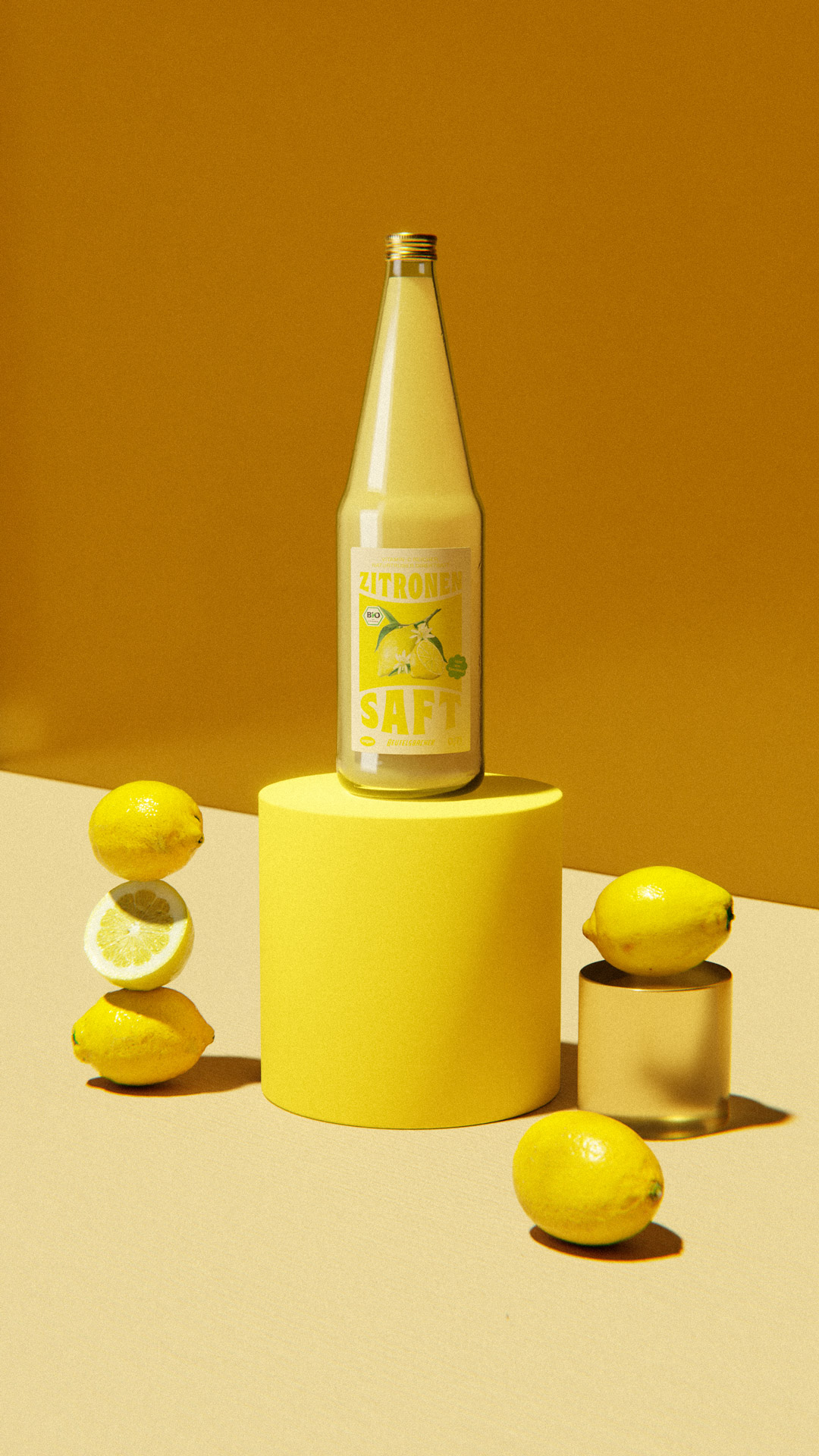
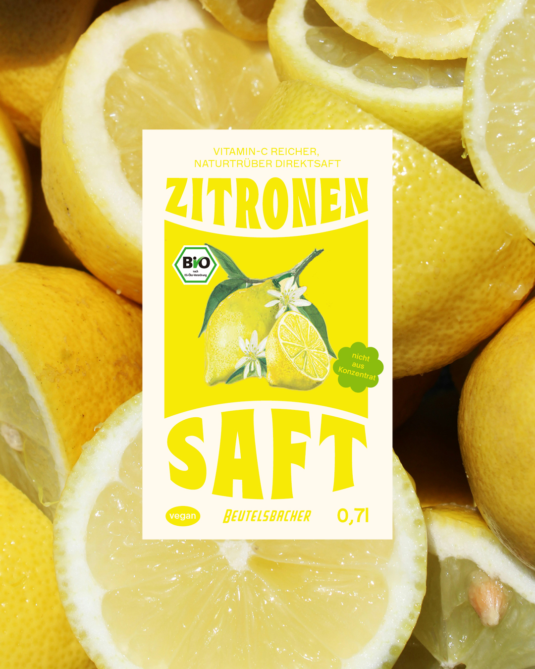
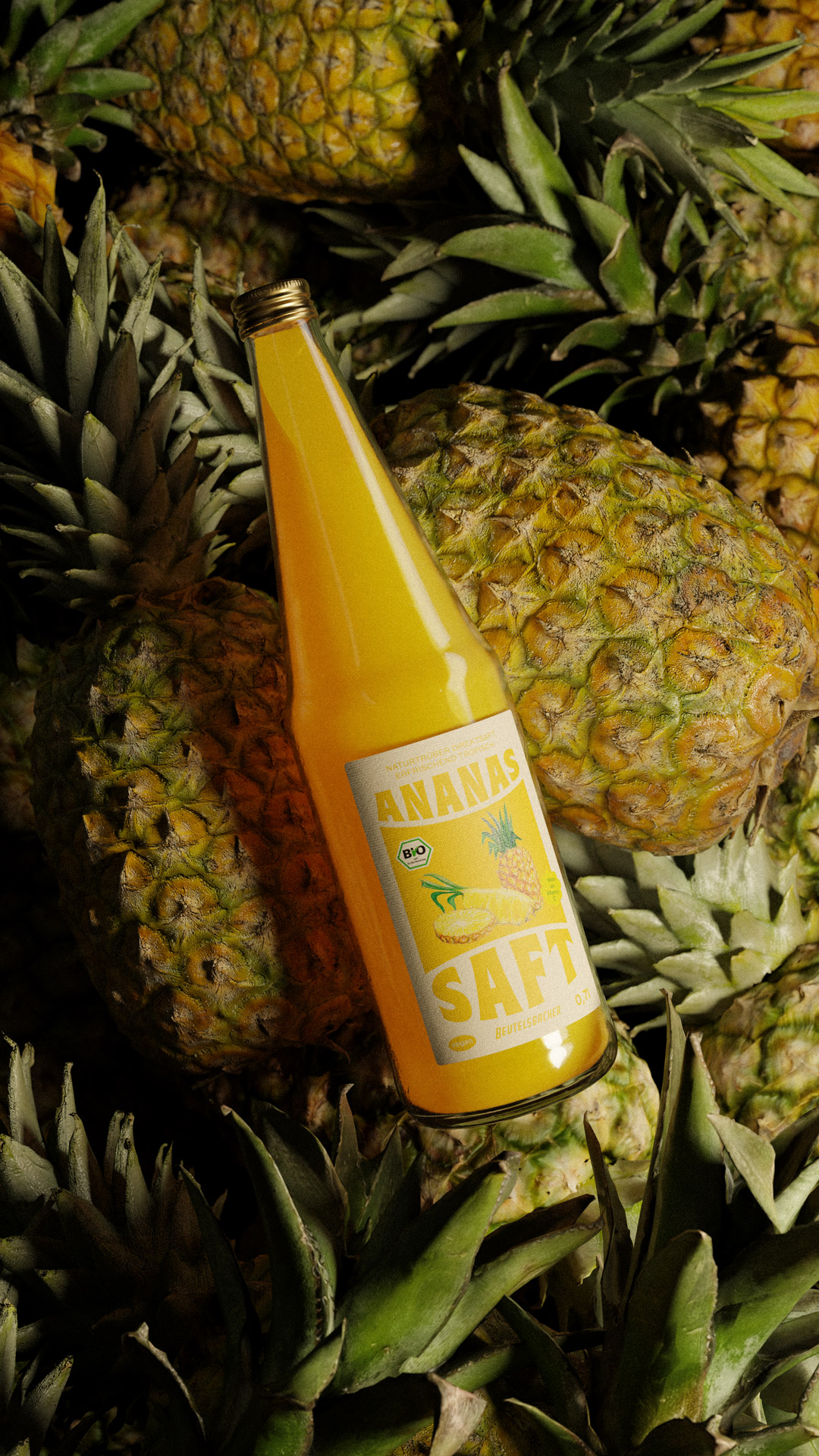
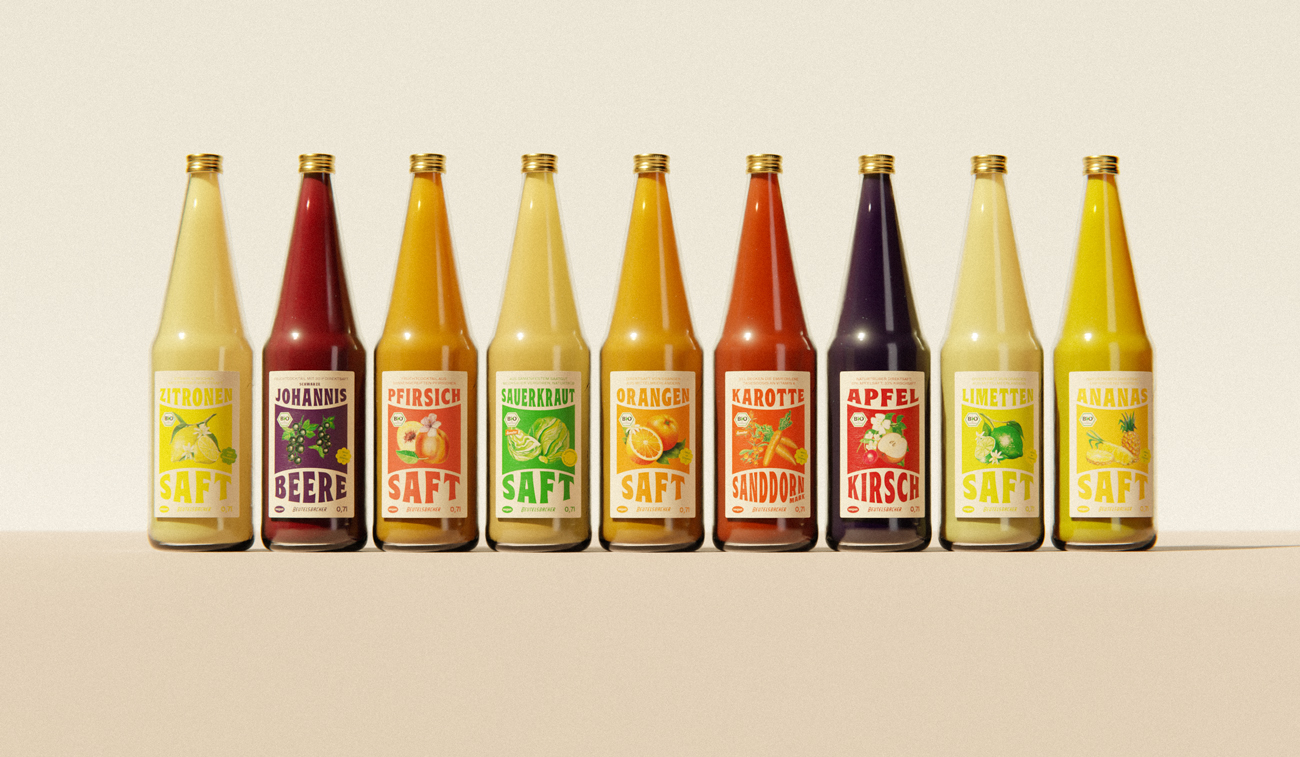
Excited to finally share this personal project I’ve been working on! Over the past few months, I learned Blender and used my new 3D skills to bring this idea to life. Not perfect, but happy with the outcome!
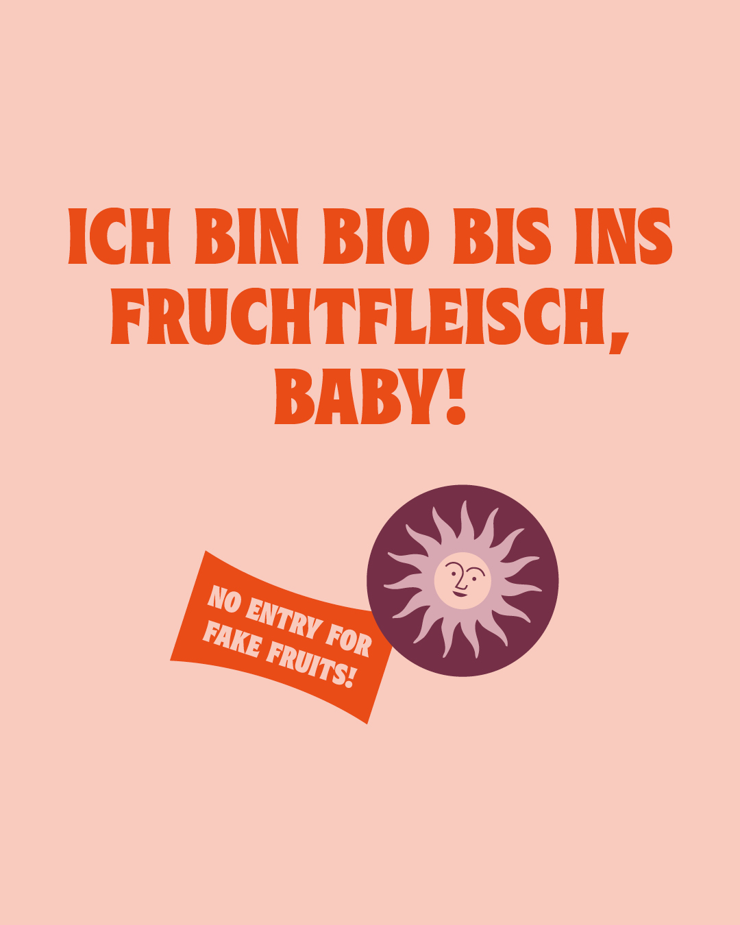
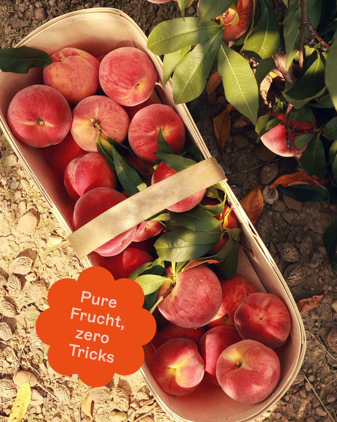
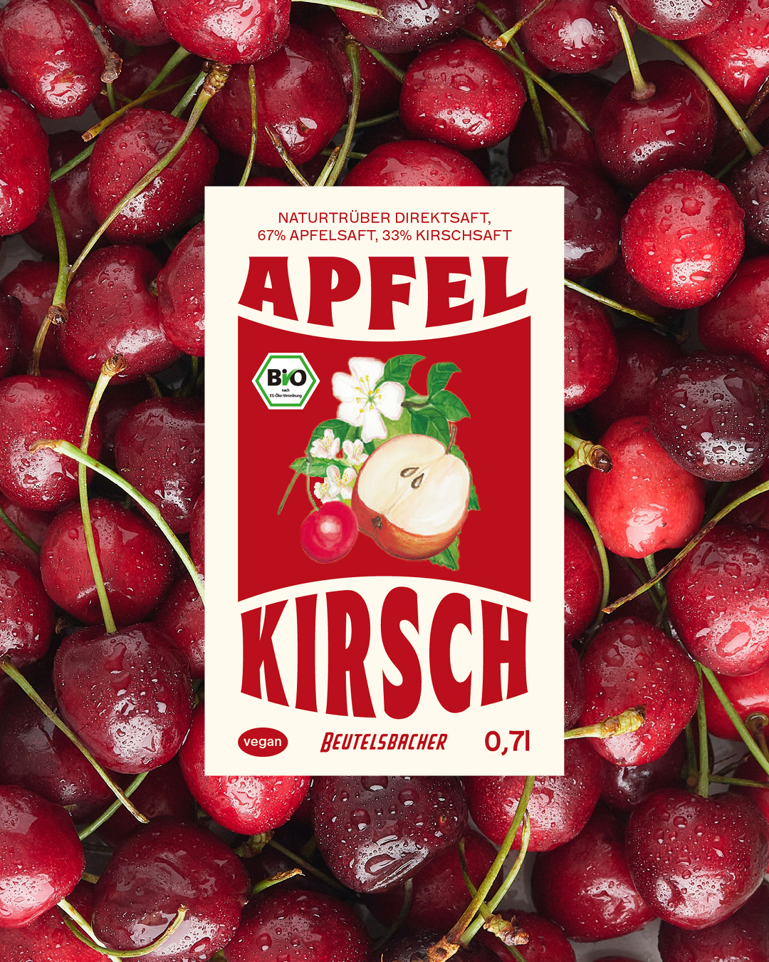
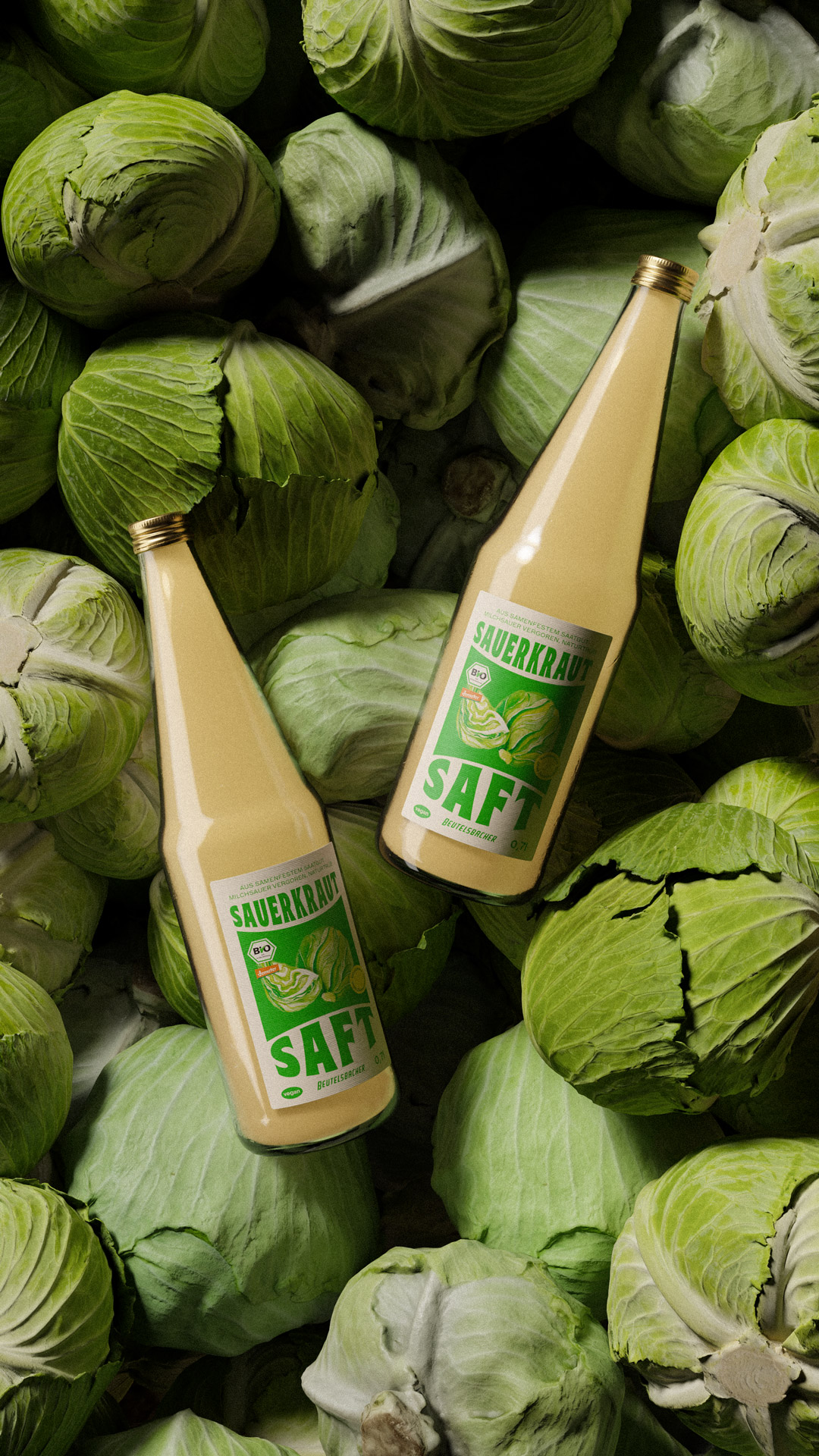
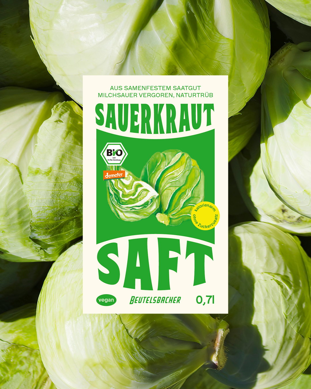
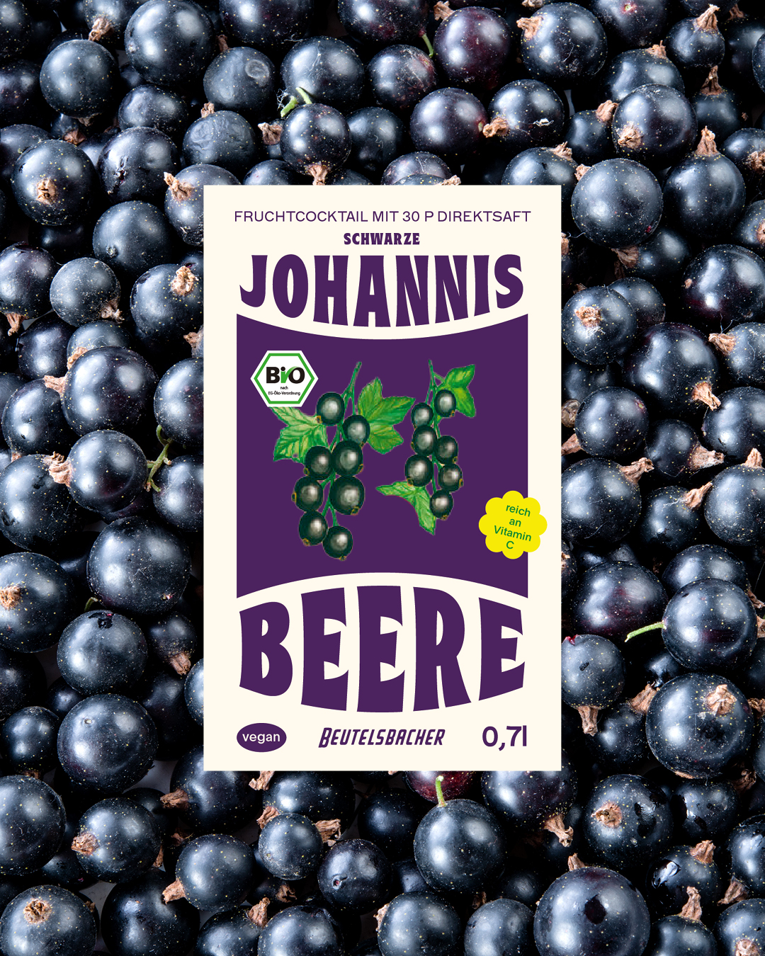
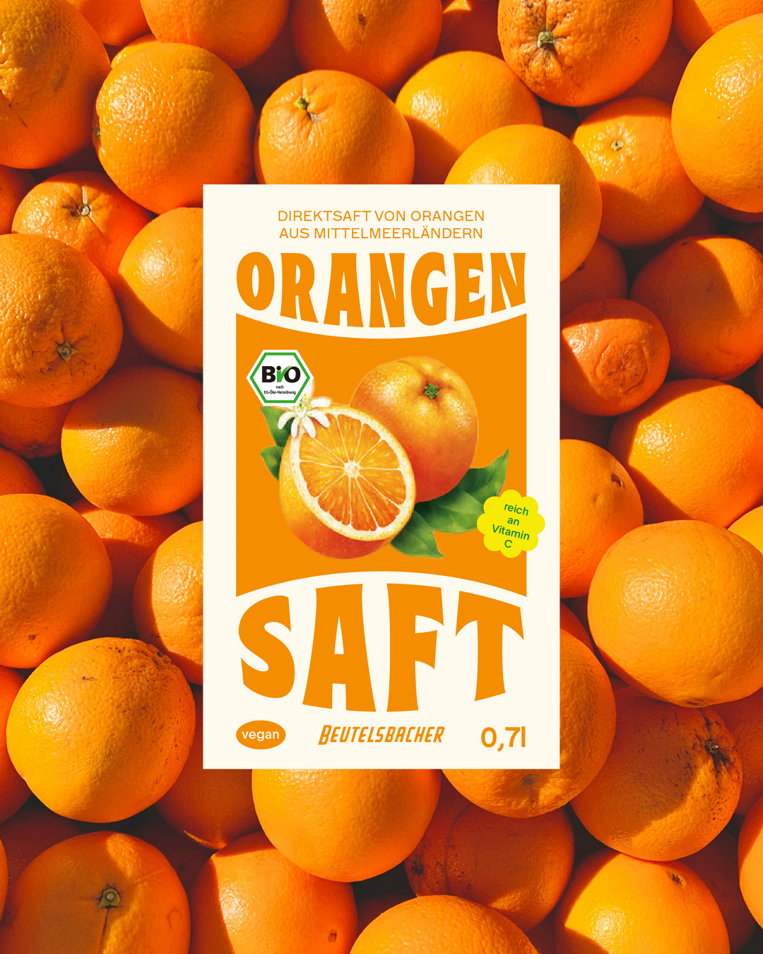
I’ve always loved the juices of Beutelbacher – my mom sells them at Marias Biotreff, so I’ve tried a lot of their range. I really admire the passion behind the brand and wanted to explore my own take on a redesign. I didn’t want to ditch their existing look completely—Beutelsbacher is well known in the organic scene. So I kept the illustrated fruits and logotype, just gave everything a brighter, more playful twist. The round shape on the label is still there, reimagined, and I chose a retro typeface to keep that nostalgic vibe. I also added a fresh version of their iconic sun character!
In early 2024, Sarah opened her psychotherapy practice with a mission to guide her clients towards a brighter, more fulfilling life. To reflect this, we've developed a brand strategy and corporate design centered around the symbol of a sunflower. Just as sunflowers instinctively turn toward the sun, Sarah helps her clients rediscover their own paths to light and positivity.
The sunflower-inspired logo embodies this philosophy, symbolizing hope, growth, and resilience. It serves as a visual reminder that, with Sarah’s guidance, her clients can always find their way back to the sunny side of life.
www.praxis-pramberger.at